
TailwindCSS is really popular and recently the same team released TailwindUI elements. There is also Tailwind Elements which have MDB styling (I now use both).
As the web is increasingly mobile first, it’s important that any site and widget is responsive. That means the app or web page looks coherent and usable whether on a small mobile, tablet, laptop, or PC screen. You’ll notice responsive pages when you change the size of the browser on a laptop or desktop machine, as elements dynamically move as the page re-arranges for the screen size.
I ran into a tiny challenge when noticing odd footer behaviour at 320px width and below on a single page application and figured it was time to make it properly responsive.
Mobile First & Responsive Design
Making a page responsive to the viewers display device is important, because as generations get younger, viewing a site is done increasingly so on mobile devices like smart phones and tablets. In fact, some statistics show millennials and younger expelling some six hours a day of screen time. Yikes.
Anyhow, none of this is new and media queries became a W3C recommended standard in June 2012. These media queries are key to responsive web design which is also tied to the mobile first movement started by Luke Wroblewski.
If you’ve done anything with Bootstrap, then you’ll probably be familiar with these concepts.
A nice way to visualise this is content is like water!

Attribution: Stéphanie Walter - CC BY-SA 3.0
TailwindCSS
In TailwindCSS I had a tiny challenge in so much I wanted a footer to be spread over two lines and centred when the media breakpoint was small (sm), covering widths lower than small (or 640px wide).
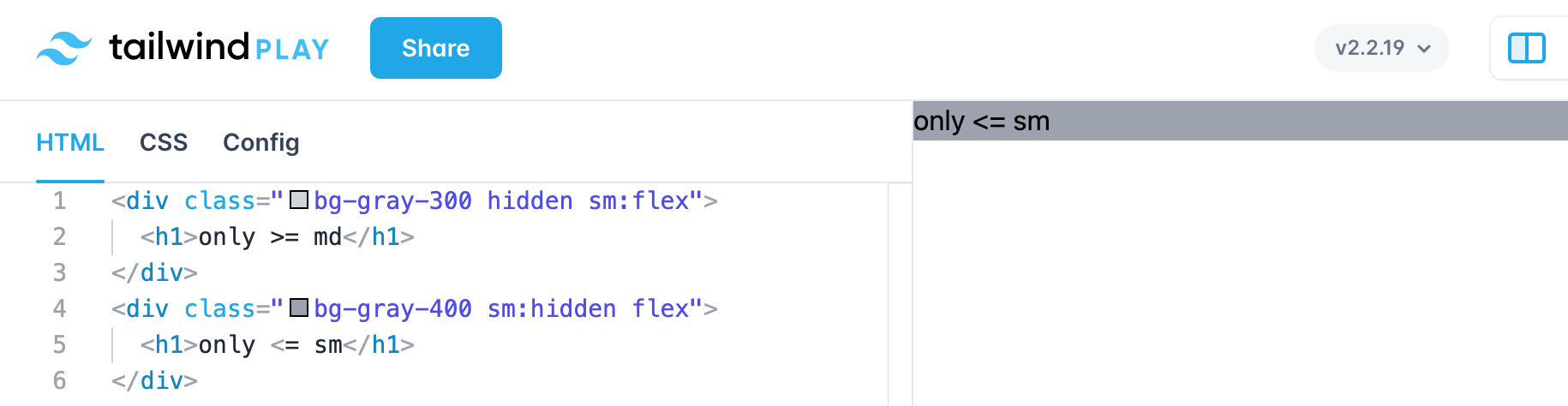
So what’s going on with the HTML and classes below?
<div class="bg-gray-300 hidden sm:flex">
  <h1>only >= md</h1>
</div>
<div class="bg-gray-400 sm:hidden flex">
  <h1>only <= sm</h1>
</div>
The top div says, hide the element, but the sm:flex, overrides hidden for the breakpoint above small.
The second div, flips the logic and says hide for everything above small.
Both divs use the flex layout.
The result is only >= md shows for above small and only <= sm shows for and below small.
There is an issue I’ve found with applying class selectors, in so much as you there needs to be a hierarchy or order, like a wide catch and a class selector. One class selector will need to another not being used at all. It’s important to test out your classes! Read this StackOverflow post.
Below is a screen shot of the TailwindCSS playground. You can click on the image, and it will take you to the playground gist.
Hope this was useful!